Search

Search


In the quest for calm, nature and light, minimalist interior colours are emerging as a key trend that redefines living and working spaces. These tones not only beautify; they care, protect and envelop, creating environments that breathe tranquillity and well-being.
Minimalist interior colours, especially those in light, neutral shades, are more than just an aesthetic choice; they are a statement of intent. These colours, from pure whites to soft greys and warm beiges, create a serene base that reflects natural light, visually expanding the space and promoting a sense of peace and order. In environments where well-being and calm are a priority, such as clinics and waiting rooms, light colours offer a safe haven, minimising stress and fostering an atmosphere of healing and tranquillity. By selecting these shades, the designers emphasise the importance of care and protection, using colour as a tool to positively influence mood and spatial perception.

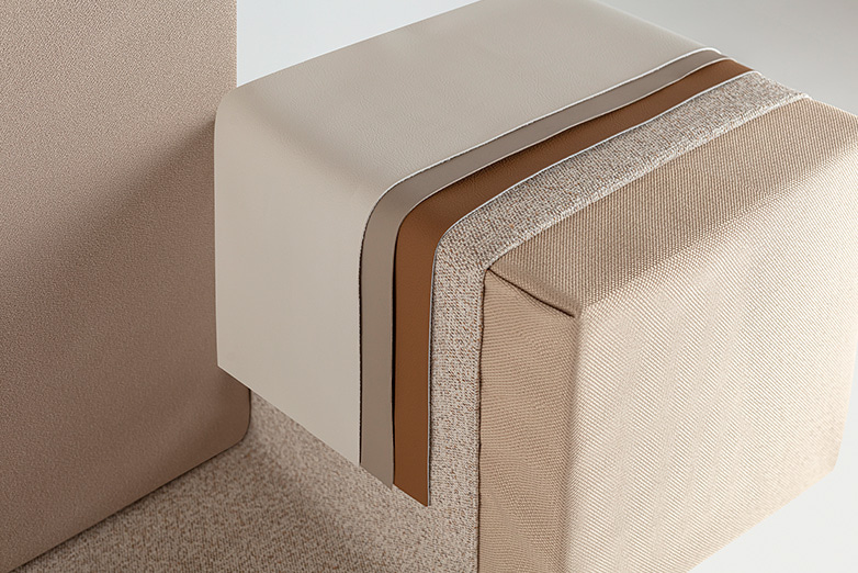
Playing with different textures and finishes in interior décor is an effective technique that can be an essential complement to colour to create more enveloping and welcoming atmospheres, fundamental for the well-being of any space. The key lies in the selection and combination of materials that, through their variety and contrast, bring depth and sensory richness to the environment. The incorporation of soft fabrics can encourage rest and relaxation, while natural elements such as wood and stone add a touch of warmth and authenticity, reinforcing the connection with the natural world. By carefully balancing these textures, designers can transform an ordinary environment into an oasis of serenity and comfort.
For designers and architects, each material selected not only defines the character of a project, but also reflects a commitment to well-being and sustainability. Aware of this dialogue between space and sensation, Actiu integrates into its design a palette of textures that promotes welcoming and productive working environments.

Investigating the relationship between sustainability and the selection of a light interior colour palette reveals how the colour palette can be a powerful ally in promoting environmentally responsible and visually appealing environments. In examining cutting-edge design projects, we see how the incorporation of soft, neutral tones not only amplifies natural light, reducing reliance on artificial lighting and therefore energy consumption, but also creates serene spaces that reflect an ecological conscience.
Often associated with recycled, renewable or low-impact materials, these tones underscore designers' and architects' commitment to sustainable practices. In addition, the minimalist aesthetic promoted by these colours facilitates timeless designs that transcend passing trends, contributing to the longevity of spaces and minimising the need for frequent renovations. This holistic approach not only enriches the aesthetic value of projects, but also demonstrates how conscious design decisions can have a tangible positive impact on our environment.

The influence of neutral and light colours in interiors on mental health and emotional well-being is profoundly significant, a fact corroborated by numerous studies and analyses. These shades, pillars of minimalist style, are recognised for their ability to create serene environments that encourage calm and facilitate concentration. The soft colour palette acts as a balm for the mind, lowering stress levels and promoting a state of relaxation and mental clarity.
In addition, the simplicity and purity of neutral colours help to eliminate visual distractions, allowing individuals to better concentrate on their tasks and thus promoting a productive and focused environment. Furthermore, integrating these colours into the interior design of third spaces creates a haven of peace that is beneficial to both the body and mind, demonstrating how design choices can have a direct and positive impact on our well-being.

As we have seen, the choice of colour in interiors is not just an aesthetic choice, but a holistic design philosophy that has a direct impact on wellbeing and sustainability. The "Light & Sustainability" trend goes beyond simple chromatic preferences and presents itself as a genuine commitment to creating spaces that are deeply nourishing for well-being and respectful of our planet.
By embracing this palette, designers and architects bring about a fundamental shift in how these spaces influence the lives of those who occupy them. Ultimately, light interior colours remind us that the true beauty and functionality of design lies in its ability to enrich the human experience and preserve the natural balance of the world around us.



Privacy policy
About our privacy policy and the processing of personal data
This Privacy Policy explains what types of personal data ACTIU collects from its customers, contacts, suppliers, partners and job applicants, why it collects such data and for what purposes. By way of definition, personal data is any information that can be used to identify a specific person (a natural person). The personal data that you are going to provide us with will be included in a file owned by our company for the purposes and under the terms set out below.
This processing is subject to REGULATION (EU) 2016/679 OF THE EUROPEAN PARLIAMENT AND OF THE COUNCIL of 27 April 2016 on the protection of individuals with regard to the processing of personal data and on the free movement of such data and on the free movement of such data.The processing of your personal data will be subject to the provisions of the European Parliament and Council Regulation of 27 April 2016 on the protection of individuals with regard to the processing of personal data and on the free movement of such data and repealing Directive 95/46/EC (General Data Protection Regulation), as well as Organic Law 3/2018, of 5 December, on the Protection of Personal Data and the guarantee of digital rights and its implementing regulations, in the event that such data refer to Spanish citizens.
Controller of the processing of your personal data
The party responsible for processing your personal data is ACTIU BERBEGAL Y FORMAS, S.A. (ACTIU).
Address: Parque Tecnológico Actiu,
CV-80 motorway, Onil-Castalla exit,
03420 Castalla (Alicante).
TAX ID: A03137874.
Telephone: +34 966 560 700
You can contact the Data Protection Delegate for any question related to the processing of your personal data at the following address: lopd@actiu.com
What types of personal data does ACTIU collect?
ACTIU collects the data strictly necessary to manage the relationships established with its clients, contacts, suppliers and collaborators. In any case, the data collected will be adequate and not excessive, being limited to what is necessary in relation to the purposes for which they are processed, and will be processed fairly and lawfully, and with due care.
The type of information we may collect will depend on the type of relationship ACTIU has with each user. In general, the most common categories are as follows:
Purposes of processing personal data. What may we need your personal data for?
If we collect your personal data, we may need it for various reasons and depending on ACTIU's activities, including the following:
The personal data you provide us with through the forms provided on the website or any other means of contact will be processed in order to deal with your queries and requests. When necessary, we will forward your request internally to the corresponding department for its correct management.
We will use your data to send you communications of interest if you have subscribed to our newsletter, communication of events, offers or any other type of service provided by ACTIU.
Legitimation: The legal basis for the processing of your data is the consent deemed to have been granted by providing us with your data and accepting this privacy policy.
The personal data that you provide us with when you maintain relations as a customer of ACTIU will be processed for the following purposes: customer management, product sales, order processing, fulfilment of tax and accounting obligations, sending quality questionnaires and sending communications of interest. In this sense, data provided from contact persons in companies that are necessary to maintain the relationship are also included in this group of interested parties.
Legitimation: The legal basis for the processing of your data is the existence of a contractual relationship and the legitimate interest of ACTIU to send you communications of interest in relation to its commercial prospecting activity to generate new business opportunities and customer loyalty, as well as to improve its services.
The personal data you provide us with when you maintain collaborative relationships and/or as an ACTIU supplier will be processed for general supplier management (supplier registration, contract management, orders and payments, etc.), for compliance with tax and accounting obligations, and to maintain a database of contacts for future contracts and/or collaborations.
Legitimation: The legal basis for the processing of your data is the existence of a contractual relationship.
The personal data you provide when you register for a competition or event will be processed to manage the event (registration, participation, voting, raffles, event logistics, publication of information and images and related activities).The personal data you provide when you register for an event or competition will be processed for the purposes of managing the event (registration, participation, voting, prize draws, event logistics, publication of information and images and related activities), and for sending you information related to the event or communications about future events and activities of interest. Please note that if you register to participate in an event, ACTIU may share basic information about participants (name, company and email address) with other participants in the same event for the purposes of communication, exchange of ideas and networking. Responsibility for the use of such data by these persons or companies is not the responsibility of ACTIU and they must ask for your consent depending on the use they want to make of it, as well as inform you of their own personal data protection policy.
Legitimation: The legal basis for processing your data is the consent you give us when you register for the competition or event and ACTIU's legitimate interest in keeping you informed about it.
In these cases, a specific privacy policy may be established depending on each event, which will be informed at the time of registration.
ACTIU may invite you to participate in questionnaires and surveys. These questionnaires and surveys will generally be designed in such a way that they can be answered without adding any personal data. If you nevertheless provide any personal data in a questionnaire or survey, ACTIU may use it to improve its products and services.
Legitimation: The legal basis for processing your data is the consent you give us when you complete the survey or questionnaire and ACTIU's legitimate interest in improving its products and services.
In order to access the facilities of the ACTIU GROUP companies, we may ask you to identify yourself in the access register. The purpose of the processing of your data is to carry out a control of visits and the management of external personnel with access to the buildings.
During your visit, images may be taken that will serve us to document the visit or event, as well as to give it visibility, through our own channels (RRSS, website or various media).
Legitimation: The legal basis for the processing of your data is the legitimate interest of ACTIU for access control and security of its facilities, as well as the registration of activities and promotion of the same.
ACTIU has a closed circuit of video surveillance cameras. The purpose of the processing of your image is the video surveillance and security of its facilities.
Legitimation: The legal basis for the processing of your data is the legitimate interest of ACTIU for the security of our facilities.
At ACTIU we will treat your personal data with absolute confidentiality, undertaking to keep them secret and guaranteeing our duty to safeguard them by adopting all necessary measures to prevent their alteration, loss, inappropriate loss, unauthorised processing or access, misuse, access, disclosure or destruction, in accordance with the legal obligations that apply to us as the parties responsible for the processing of your personal data. To protect this personal information, we take reasonable precautions and follow industry best practices.
The information you provide to us when you apply for a job offer or submit a curriculum vitae (CV) will be processed for the following purposes:
Legitimation: The legal basis for the processing of your data is your own consent, which is granted by sending your CV and accepting the privacy conditions.
The personal data you provide us with through the form provided in the Ethics Channel or through a complaint filed with the company by any other alternative means (e-mail, post or personal interview) will be processed for the purpose of managing the investigation procedure.
Retention of your data
The data will be kept, in the case of customers or suppliers and their employees, for the duration of the contractual relationship and, thereafter, for the legal periods established by law for the prescription of contractual obligations, as well as for matters related to accounting and tax legislation. In all other cases, the data will be kept in accordance with the conditions established in the collection, for the time necessary to achieve the purpose for which they have been processed or until you withdraw your consent, object to the use of the data or inform us that you wish to delete them from our database.
In the case of images captured by our video surveillance systems, these images will be kept for a maximum period of one month.
In the case of sound, video and other images, they may be retained for educational, informational and/or promotional reasons (internally and externally) for a longer period of time, especially if they have been published on portals, networks or other media. In such a case, personal data will be limited to that strictly necessary for the maintenance of such information.
Disclosure
We may disclose your personal information if we are required to do so by law or if you violate our terms of service.
Where your consent is required to disclose your personal data to third parties, we will inform you on the data collection forms about the purpose of the processing, the data to be disclosed and the identity or business sectors of any potential recipients of your personal data.
Data processing by third parties
We inform you that ACTIU's service providers may have access to your data when it is necessary for the management of the services provided or contractual relations established with ACTIU, as well as for the maintenance of its systems (financial institutions, data storage, computer support and systems maintenance, legal, tax or accounting consultancies). Some of these companies may be located outside the European Union, so we will ensure that these suppliers comply with the guarantee requirements demanded by the applicable regulations on personal data protection. If you would like to request information about the suppliers with access to your data, you can contact us at lopd@actiu.com.
In the event that you contact us through one of our forms or through third parties (architectural portals, etc.), either to request information of any kind or to purchase any of our products or services, in order to answer your questions or analyse the needs raised in a personalised manner, we may respond directly or through the members of our network of distributors or collaborators in your place of residence, to whom we will send your data for this purpose.
All the entities referred to in this section will use this data for the same purposes and subject to the same conditions specified in this Privacy Policy.
ACTIU undertakes to maintain the confidentiality of the personal data provided, as well as to apply the security measures provided for in Spanish and European legislation, and to require third parties to whom the data is communicated to adopt identical measures.
Location of the information
All personal data related to the organisation and management of events are stored in secure computer applications and servers, as well as in specific electronic folders accessible only to authorised persons. ACTIU systems and servers are password protected and require an authorised username and password for access. Information is stored securely to safeguard the confidentiality and privacy of the data it contains. Paper documents are kept in secure cabinets or files.
In addition, all persons handling personal data within the ACTIU sign a confidentiality statement.
User rights
Your rights as a user in relation to the personal data you have provided to us (commonly known as ARCO-POL rights) are as follows:
These rights differ depending on the local data protection laws in each country, state or territory. However, they may include more or less of the above rights.
If you believe that ACTIU is not processing your personal data in accordance with the requirements specified in this Privacy Policy or in the applicable data protection legislation, you may lodge a complaint with the Spanish data protection authorities (Agencia Española de Protección de Datos).
Links to other websites
Our website or any of our social media posts may contain links to websites external to our company. In these cases, ACTIU is not responsible for the privacy policies or the content of such sites. We recommend that you carefully read the privacy policies of such websites and social media sites.
Changes to the Privacy Policy
We reserve the right to modify this Privacy Policy at any time and without prior notice, especially due to possible changes in regulations, jurisprudence or the criteria followed by the competent authority or the Spanish Data Protection Agency, so it is advisable to visit it regularly. Changes and clarifications will come into force immediately after their publication on the website. If we make material changes to this policy, we will notify you here that it has been updated.
Questions and contact information
If you have any questions or concerns, you may contact us through any of our communication channels.
However, to exercise your ARCO-POL rights or to register a complaint, you may contact our dpo at lopd@actiu.com, or by post to:
Address: Parque Tecnológico Actiu,
CV-80 Highway, Onil-Castalla exit,
03420 Castalla (Alicante).
TAX IDENTIFICATION NUMBER: A03137874.
Telephone: +34 966 560 700
Cookies policy
You can visit our cookie policy here.
Last updated: February 2023
Applications for selection processes
Maintenance of your data
The data will be kept for a maximum period of 2 years from its incorporation into our database or from its last update or modification carried out or requested by the candidate, being subsequently deleted or unusable on its servers as far as the security and data management system allows it. We inform you that you can update or modify your CV in our database at any time by re-entering it or informing us in writing.
Data processing by third parties
We inform you that ACTIU's service providers may have access to your data when it is necessary for the management of the services provided or contractual relations established with ACTIU, as well as for the maintenance of its systems (data storage, computer support and systems maintenance, legal, tax or accounting consultancies, transport companies or travel agencies). Some of these companies may be located outside the European Union, so we will ensure that these suppliers comply with the guarantee requirements demanded by the applicable regulations on personal data protection. If you wish to request information about the suppliers with access to your data, you can contact us at lopd@actiu.com.
All the entities referred to in this section will use this data for the same purposes and subject to the same conditions specified in this Privacy Policy.
ACTIU undertakes to maintain the confidentiality of the personal data provided, as well as to apply the security measures provided for in Spanish and European legislation, and to require third parties to whom the data is communicated to adopt identical measures.
Acceptance of the privacy policy
Submitting your CV or your application for any of the positions published on our website implies that you have read, understood and accept ACTIU's privacy policy, giving your consent for Actiu to process and transfer your personal data according to the conditions indicated in this Policy. To this effect, if you use our web portal, you must tick the acceptance option before sending your CV and/or application. In case of delivery or remission by other means, this Privacy Policy will apply to you, informing you that you can make use of your rights as informed in the point "User rights".
We inform you that your refusal to provide the required data or your non-consent to the use of the same in accordance with this policy will prevent us from processing your application.
Ethical channel
Maintenance of your data
The data processed when you file a complaint through the Ethical Channel or any other alternative method may be kept in the information system only for the time necessary to decide whether to initiate an investigation into the facts reported. In any case, if three months have elapsed since the receipt of the communication without any investigation having been initiated, they must be deleted, unless the purpose of their retention is to leave evidence of the operation of the system. If, in fact, the aforementioned possibility of conservation is chosen, the Head of the Internal Information System shall report on the appropriateness of leaving the aforementioned evidence, adopting all the custody measures that may be appropriate. In these cases, the user may not exercise his or her right of objection and suppression.
In any case, personal data relating to information received and internal investigations will be kept for as long as necessary, although the data may not be kept for a period of more than ten years under any circumstances.
Persons entitled to access your data
Access to the personal data contained in the Internal Information System shall be limited, within the scope of their powers and functions, exclusively to the following persons:
In the aforementioned cases, the corresponding document offered by the administrative body shall be signed, regulating the status of data processor of the said authorised persons.
However, the processing of the data by other persons or even the communication to third parties shall be lawful, when necessary for the adoption of corrective measures in the entity or the processing of the sanctioning or criminal proceedings that, as the case may be, may be applicable.
Personal data that are not necessary for the knowledge and investigation of the actions or omissions reported shall not be processed and, where appropriate, shall be deleted immediately.
Processing of data by third parties
We inform you that ACTIU service providers may have access to your data when it is necessary for the management of the services provided or contractual relations established with ACTIU, as well as for the maintenance of its systems (data storage, IT support and maintenance of systems, or legal advice). Some of these companies may be located outside the European Union, so we will ensure that these suppliers comply with the guarantee requirements demanded by the applicable regulations on personal data protection. If you wish to request information about the suppliers with access to your data, you can contact us at lopd@actiu.com.
All the entities referred to in this section will use this data for the same purposes and subject to the same conditions specified in this Privacy Policy.
ACTIU undertakes to maintain the confidentiality of the personal data provided, as well as to apply the security measures provided for in Spanish and European legislation, and to require third parties to whom the data is communicated to adopt identical measures.
Disclosure
We may disclose your personal information if we are required to do so by law or if you breach our terms of service.
Acceptance of Privacy Policy
By submitting a complaint through ACTIU's internal reporting system, you signify that you have read, understood and agree to ACTIU's Privacy Policy and consent to ACTIU's processing and disclosure of your personal information in accordance with the terms and conditions set out in this Policy. To this effect, if you use our web portal, you must check the acceptance option before sending your complaint. In the event of delivery or forwarding by other means, this Privacy Policy will apply to you, informing you that you may exercise your rights as described in the section "User rights".
We inform you that your refusal to provide the required data or your non-consent to the use of the same in accordance with this policy will prevent us from being able to process your request.
In relation to the Data Controller, Purposes and legitimacy for processing, User Rights and Changes to the Privacy Policy, we refer to the general part of the ACTIU Privacy Policy.
Date of last update: May 2025